Ok, the goal here is to create a room whose walls appear to be painted with separate but well integrated textures… this is something you need to learn pretty quickly when editing Quake 2. Tim Willits mastered this in his levels in Quake2, and that's basically where I got the inspiration for the base style I used in Abandon All Hope. The textures were made to be used this way, and are usually clustered together by name in a manner that makes it easy to find a nicely fitting group of textures for your room. For instance, a lot of the e1u1 textures are 64x64, and their edges are specifically drawn to fit together perfectly with one another.
The idea is to let the textures do the work for you. Complex architecture may look pretty cool, but your speeds will suffer, and your vis times will completely skyrocket. So instead of adding to your poly count by crafting decorations, it's a lot more effective in the Quake engine to simply meld two brushes, each painted with a well fitted texture.
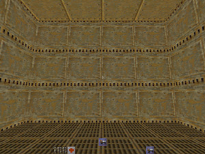
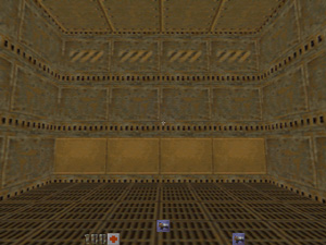
Here you've got a simple wall. Paint it with one of the "duct" textures from e1u1… you'll notice that the texture doesn't look so hot when it's used on a large brush. So take that section of wall, decrease it's height by 64 units, and create another brush of equal width and length, this one 64 units high. Place this section in the spot that's now open from decreasing the former large wall brush. Here's 2 screenshots, before and after:
This adds alot, without the need for complex architecture and outcroppings which slow down the level... plus it's simply got a nice even flow which doesn't draw your attention immediately, but creates a deep atmosphere within your level... to me, that's the difference between a level thats a work of art, and one that's "pretty cool". The best authors out there have this method down, and use it alot.
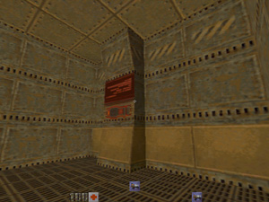
Let's throw a wall support in now, using the same principle:
... no seams, blended well... get a motif like this going, and your level is one step closer to becoming a classic... take for instance this hallway from abandon:
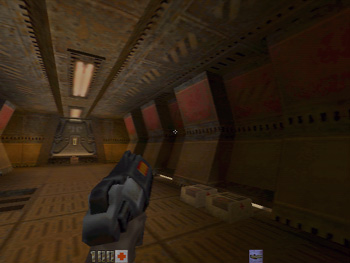
I've used this effect to create an entire hallway, including the ceiling, walls, and support structures. Notice the depth and atmosphere this gives to the area. I'd say that this hallway was the first time I truly had that lightbulb flicker in my skull about the "art" of texture use... before this, I'd fight the editor alot trying to stretch and align whatever texture I was working with to fit the architecture. The key is, the OPPOSITE is what you should aim to do: design the architecture around the textures you will be using for your level. Of course, the brush count here is significantly higher than a simple cubic hall would give, but chances are that if you build a simple cudic hall, you're going to spend alot of time and waste alot of cpu power on decorations, or the hallway will end up looking quite plain.
One other thing I should mention is light fixture placement. Personally, I like to carve my light brushes into the wall... some authors, even very good ones, don't mind having their lights jut out from the wall, which makes editing alot easier for them, as they don't have to deal with carving up their walls. If you do decide, however, to carve your lights into walls, keep in mind that you should make your light brush at least as thick as your wall, or you'll be splitting your wall brush not only into the 4 sections that result from splitting with a cude, but a 5th section, lengthwise, resulting from splitting a brush with another which is less thick. This makes it alot more difficult to move and resize your walls, and should you have alot of lights like this, you'll soon end up with a nasty mess.
J Parkman